A kitchen with oak floors and oak cabinets in the same honey shade is not a mistake. It is a decision nobody made — one sample carried to two showrooms, settling both questions at once. The result is a room full of wood with no edge where the floor meets the cabinetry.
Why the matched oak kitchen flattens a room
Base cabinets run about 34½ inches high before the counter goes on, so the bottom third of every wall is cabinetry and the floor is the plane it meets. Match species and stain and that meeting vanishes; the cabinets look like they grew there.
In a cottage kitchen, continuity is the point. In a run of built-ins it costs the eye the joint it uses to judge height and depth, and a 10-by-12-foot room reads as one brown envelope. It also dumps the contrast work onto the counter, the splash and the hardware, and the counter is the most expensive place to make a statement.
Three relationships, not two
Most people frame this as match or clash. There is a middle setting, and it is where good kitchens live.
Match. Same species, same stain family, within a shade. It works in galley kitchens under 8 feet wide, where one tone makes a narrow room feel wider, and in period houses where floor, doors and trim were always a single wood. It also works when the cabinets are freestanding furniture. It fails as a full run of built-ins in the floor’s oak.
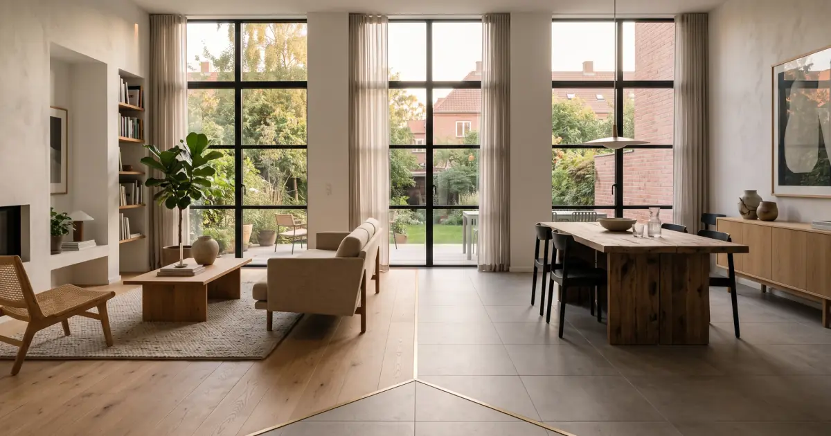
Near-match. Same family, one step apart: white oak under rift-sawn cabinets washed two shades lighter, or a plain-sawn floor with quarter-sawn uppers, where ray fleck does the separating that color would otherwise do. This keeps an open-plan kitchen quiet inside a living room. The seam stays visible, but it is a whisper.
Contrast. A different species, or paint. Contrast gives the kitchen a focal point and wants a room with edges to hold it. In an open plan it belongs at the transition rather than the cabinet line — a problem with its own answers.
| Relationship | What the eye reads | Best in | Main risk |
|---|---|---|---|
| Match | One continuous material; no base line | Galleys under 8 ft; period rooms | Built-ins lose height and depth |
| Near-match | Continuity with a visible joint | Open plans sharing one floor | Two browns that read as a near-miss |
| Contrast | A deliberate ground and object | Closed kitchens; dark floors | Cabinets become the only event |
When an undertone clash reads as a mistake
Two woods of different temperature can sit together beautifully or look like a paint error. The difference is usually value, not hue.
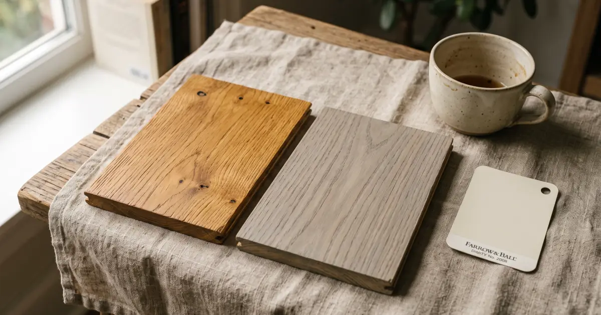
The clash reads as a mistake when surfaces are close in lightness and opposite in temperature. Orange oak under gray-brown cabinetry is the classic case: the eye tries to reconcile them because they sit at the same depth, fails, and reads mud. The same oak under a cabinet two steps lighter, or a genuinely dark green, stops being a problem.
It reads as intentional when the temperature gap is wide enough to name out loud, when the value gap is a clear step, or when a third material cuts between them so they never touch. Red oak punishes indecision most: its pink base pushes toward any nearby cool gray, and a north-facing kitchen with warm white walls makes it redder.
Painted cabinets against wood floors
Paint removes the species question and replaces it with a temperature one. The floor supplies the warmth; the cabinet agrees, cools it, or answers it. The logic of color pairings sits underneath all three directions.
Sage, cream, charcoal
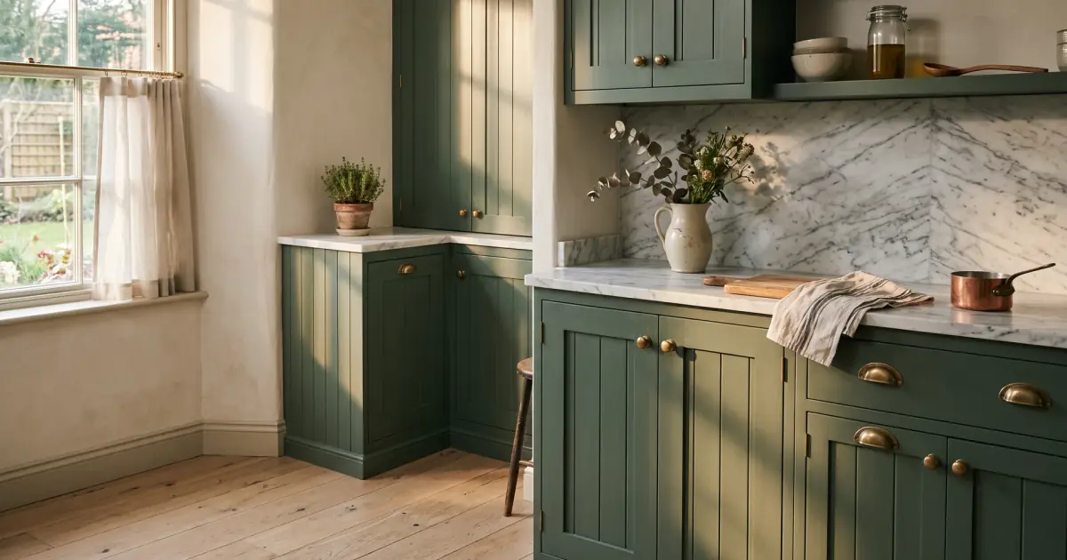
Sage is the most forgiving, provided it is gray-green rather than bright. On white oak it reads almost coastal. On orange oak it needs enough gray to mute the floor’s pink; a clear mid-green against red oak looks like an error from the doorway.
Cream needs a value gap. An off-white slightly lighter than honey oak reads dingy by late afternoon, because the floor’s warmth contaminates the paint. Push it two or three steps lighter, or give it a white counter and splash. On walnut, cream is close to foolproof.
Charcoal adds weight and absorbs light. On pale ash or white oak it makes cabinetry read as furniture and settles a large room. On walnut it can vanish, leaving the counter floating. Over a dark floor, run it to the ceiling so the mass becomes a wall, keep the walls two steps lighter, and finish a 4-inch toe kick in the floor’s tone so the base sits down.
Walnut floors with pale or painted cabinetry
Walnut asks for pale cabinets more often than any other floor, and the pairing is not merely light against dark. Its base is purple-brown, its grain low and even, and it reads cooler and denser than oak.
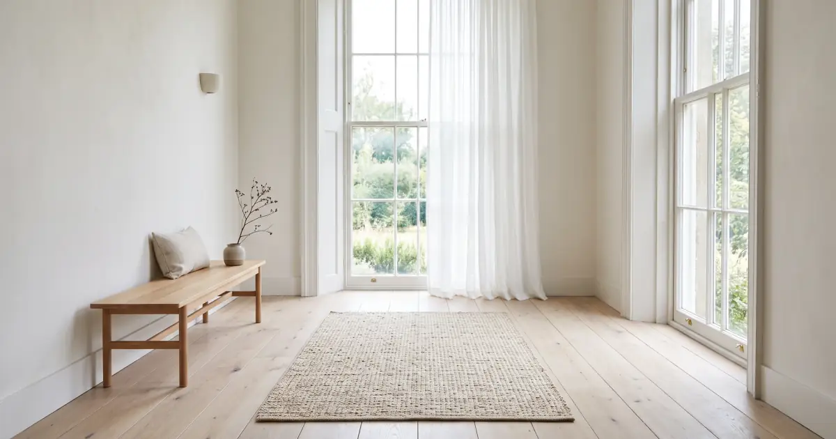
Paint is the easy answer: bone, putty, soft gray-green, chalky white. It gives the walnut a clean edge and keeps the room from feeling like a showroom. Pale wood is harder. Ash, bleached oak and maple sit close enough in hue that the result reads as two browns of different ages. Go much lighter than instinct suggests, or choose a cooler species so the difference is tonal rather than accidental.
In a small kitchen, five-inch planks along the long wall of a 10-foot room will stretch it, and pale cabinets to the ceiling pull the eye up. Avoid walnut under dark cabinets with one small window; the floor stops reading as a floor and starts reading as a shadow.
The counter and backsplash as mediator
The counter is a horizontal band at 36 inches; the splash a vertical one of 18 to 24 inches, or full height to the uppers. Together they are the buffer, and they can do the separating the floor and cabinet refuse to do.
If floor and cabinet are close in tone, make the counter the lightest surface and let the splash agree. That gives the eye a clean line at 36 inches and another at the wall, and the wood tones read as a floor and a cabinet rather than a failed match. If they are already in contrast, keep the stone mid-tone and quiet.
A 1- to 1½-inch overhang past the cabinet face casts the shadow that separates cabinet from counter; a flush counter loses it. And a full-height splash in the counter’s stone merges wall into countertop, making a small kitchen taller and a large one calmer.
Small kitchens and dark floors
A dark floor in a small kitchen is not the automatic mistake people assume, but it has conditions. The room needs a pale vertical surface within sight of the door, and the cabinets should be it. An 8-by-10-foot kitchen with walnut under bone cabinets to the ceiling feels grounded; the same room with mid-tone oak cabinets and a dark counter feels like a box with the lid on.
Plank direction is the lever that does the most. Boards along the longer wall — 12 feet rather than 9 — widen the room, and a 3½- to 4-inch toe kick finished to the floor lets the cabinetry sit on the dark plane rather than hover above it. Run the planks across and the eye stops at every cabinet return, the same geometry behind our small-room flooring notes.
The one-wood rule, and its exceptions
The default is worth keeping: one wood tone per room, everything else painted, stone, metal or textile. It is why a kitchen with oak floor, oak cabinets, an oak table and an oak butcher block can feel airless when each piece is good on its own.
A second wood is fine when it is furniture rather than architecture — a walnut island on white oak, one teak chair, a pine dresser that was always going to be the odd one. It is fine in a separate plane: a cedar ceiling 9 feet above an oak floor does not compete, because nothing joins them. And it is fine within a species across cuts, since plain-sawn and quarter-sawn oak read as variations on a material.
What fails is the accidental second wood: oak floor, oak cabinet, then an oak shelf from another supplier with another stain. The rule is a test of whether the second tone was chosen or merely arrived.
A testing method that takes an afternoon
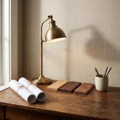
Ask for a cabinet door in the actual finish, not a chip; 12 by 18 inches reads at distance and shows how the sheen behaves. Get a floor offcut a foot square from the same lot as the order, not a showroom display that has sat under fluorescents for two years.
Put both on the floor where they will live and stand back 10 feet. Repeat at 8 in the morning and 4 in the afternoon. Look from the doorway you use most, at eye height, not from above.
At night, switch on the bulbs you plan to install. A 2700K lamp pulls both samples warmer; a 3000K one flattens the difference. Then photograph the pair in black and white. If floor and cabinet merge into one gray, the contrast is not doing any work.
The short version
Matching floor and cabinets is a safe default that costs a kitchen its base line. Aim for near-match in open plans, contrast in closed rooms, and settle undertone by value rather than hue. Paint is the easiest contrast to live with, provided the cream is genuinely lighter than the floor and the charcoal genuinely darker. Test with a door sample and a floor offcut, on the floor itself, in the light the room actually gets.
Three things to take away
Decide whether the kitchen needs a match, a near-match or a contrast before choosing a species.
Separate two wood tones with a painted or stone surface instead of butting them together.
Test a cabinet door against a floor offcut in the light the kitchen actually gets.
Written by
More about the desk